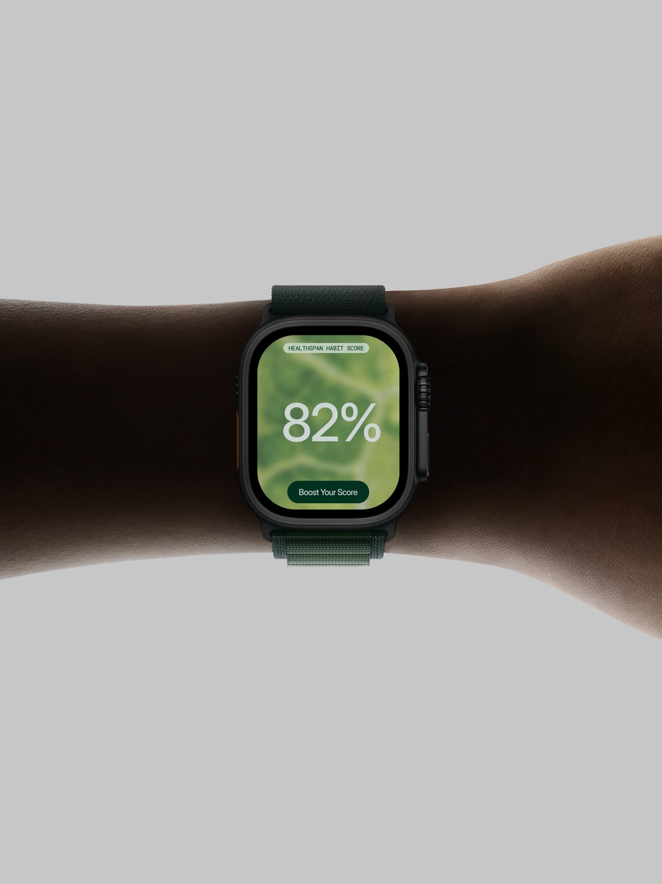
Inside Tracker™ Reimagined.

InsideTracker is a health optimization platform built around data from DNA, blood, fitness, sleep, and other biological signals. But the original brand positioned the product primarily around tracking — and that message wasn’t fully resonating with the B2C audience.
We reimagined InsideTracker around a simpler, more human idea: the value isn’t in tracking everything. It’s in living a longer, healthier life.
The original USP, “Track everything,” described the product, but not the outcome. It left an important question unanswered: What do I actually get from tracking my DNA, blood, sleep, or fitness?
We shifted the communication from the technology behind the product to the benefit it delivers — adding healthier years to your life. Instead of leading with the app, the data, or the tracking itself, the new direction leads with the outcome: better health, better decisions, and more healthy years ahead.
Inside Tracker™
2026
Brand Strategy
Visual Identity
Web Design
Web Development
Creative Direction
Narrative
Graphic Design

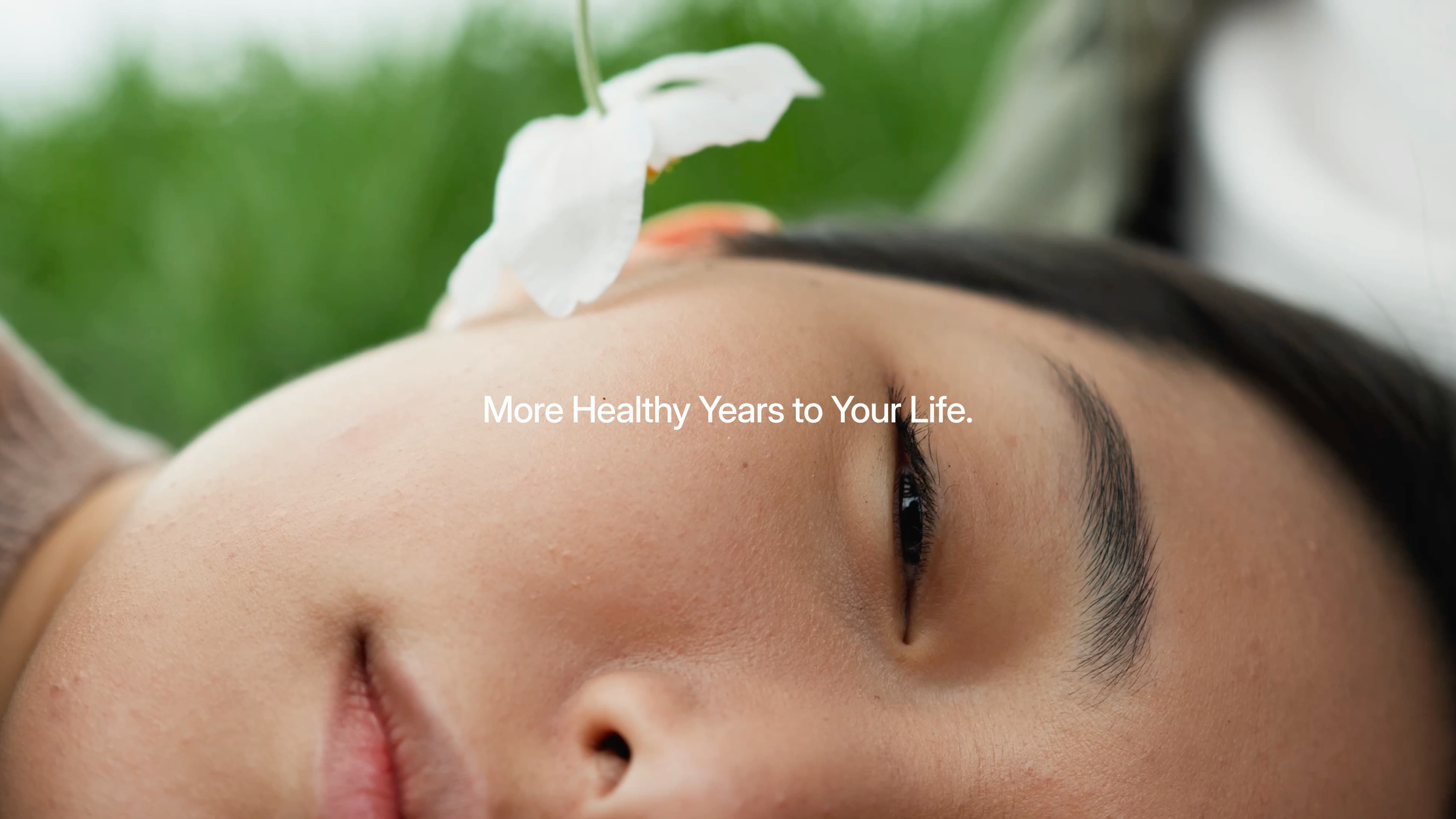

A new symbol for health and technology.
The original blood-drop logo reinforced the medical side of the brand.
We redesigned it to move away from medicine and toward a more technological, centered, and holistic representation of the inner body. The new mark explores a circular form with an inner focus — reflecting the idea of looking deeper into what is happening inside the body and using that information to improve health.

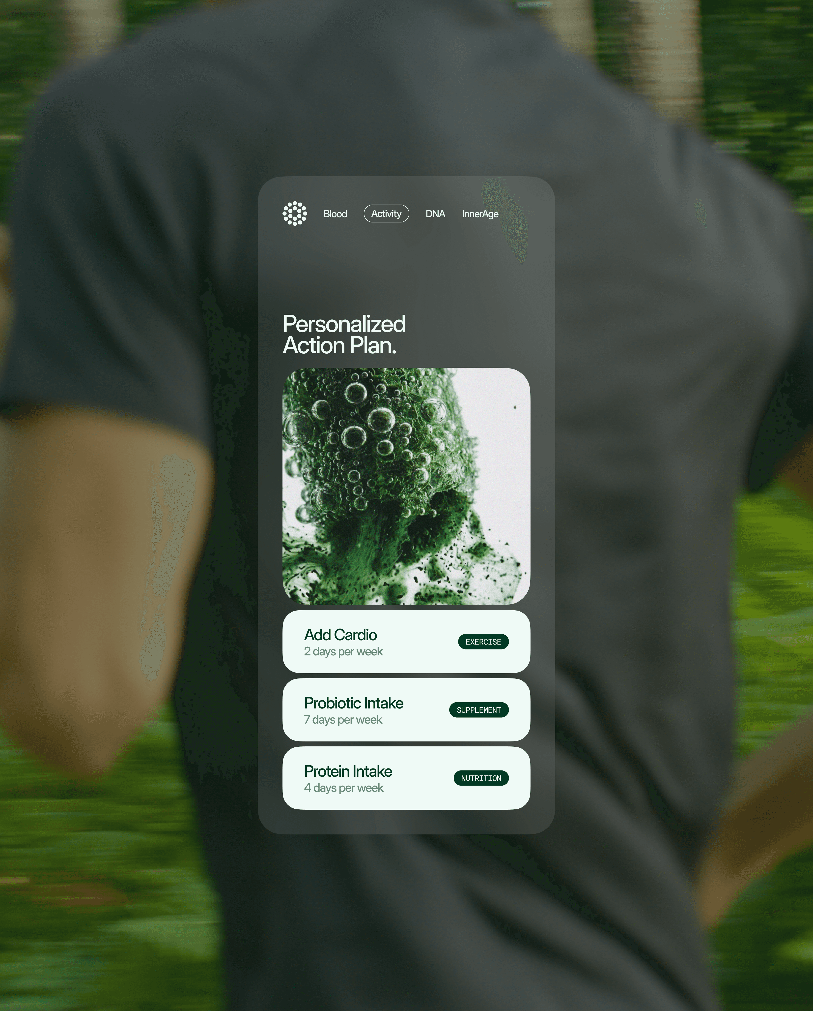
The visual identity was pushing the brand toward a clinical, medical aesthetic. While this could work well for a B2B audience, it created distance from the more personal and emotional B2C experience.
We introduced a more natural visual language built around green, nature, and the human body.
The palette moved away from traditional pharmaceutical greens and clinical cues toward deeper, more organic tones. The art direction became warmer and more human, creating a stronger connection between science, nature, and everyday life.